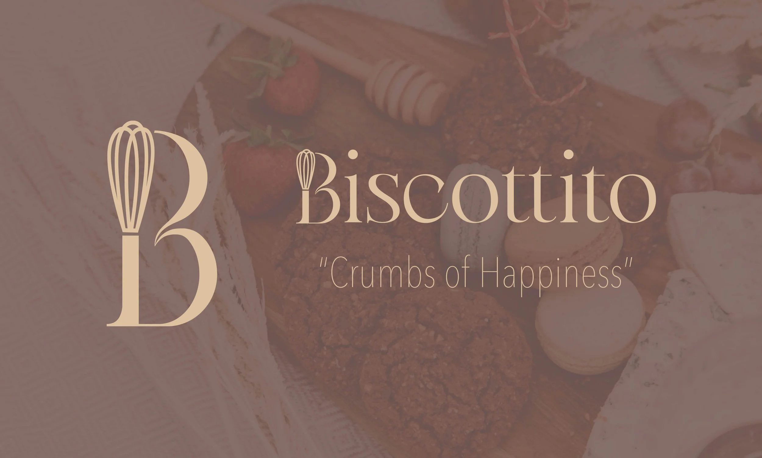
Introducing

Biscottito
Branding and visual identity patisserie/bakery
Published: August 4, 2025
Problem
The project aimed to define a clear and cohesive identity for a whimsical European-inspired patisserie that evokes warmth, nostalgia, and artisanal care. The challenge was to develop a brand system capable of communicating delight, playfulness, and handcrafted charm, qualities that help a small bakery stand out in a crowded market.
Target Audience
People who appreciate artisanal baked goods and cozy, joyful experiences.
Customers drawn to warm, inviting, and nostalgic aesthetics (e.g., pastel palettes, soft typography).
Likely young adults to mid-career adults who value boutique food experiences and visual storytelling in branding.
Concept
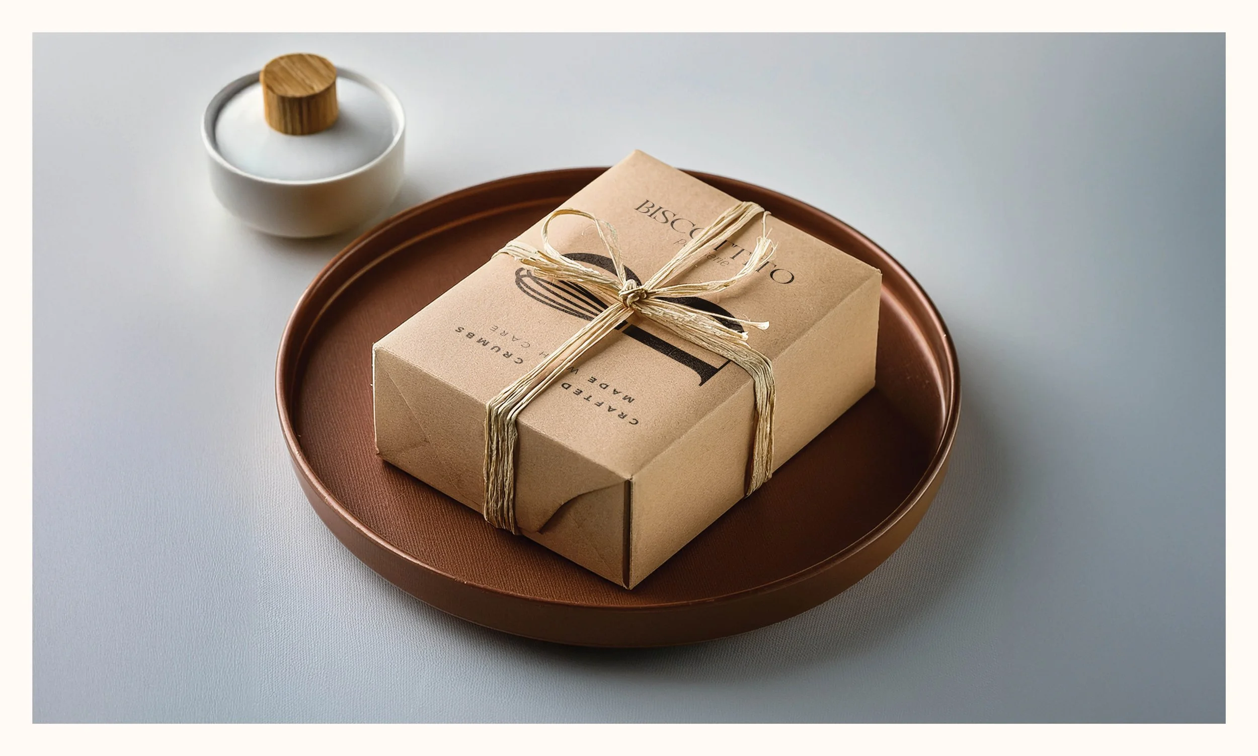
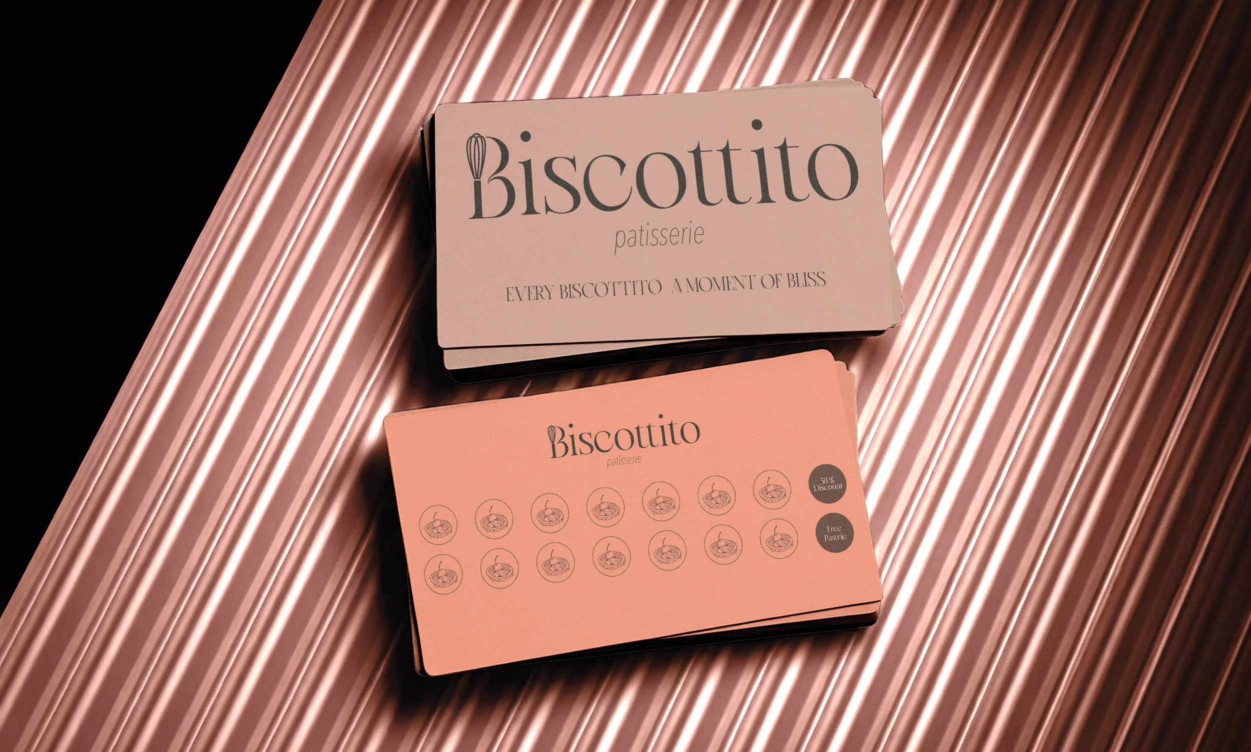
Biscottito’s concept centers on creating a brand personality that feels like a warm hug with sprinkles — playful, tender, and distinctly European in charm. All brand elements (logo, colours, typography, imagery) revolve around:
Soft pastel palette that evokes sweetness and comfort.
Delicate type choices that feel handcrafted and welcoming.
A visual language that suggests tiny treats, buttery pastries, and personal moments.
The goal was to build a visual world that doesn’t just represent a bakery — it feels like one.

Solution
To address the design challenge:
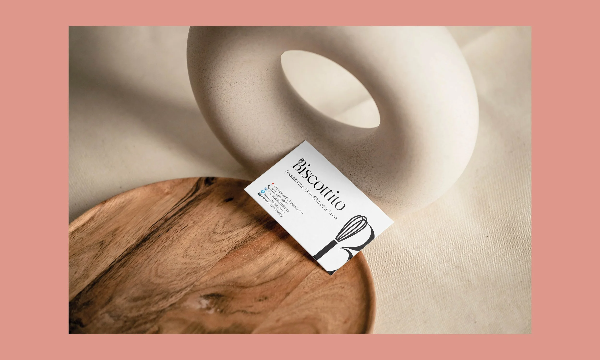
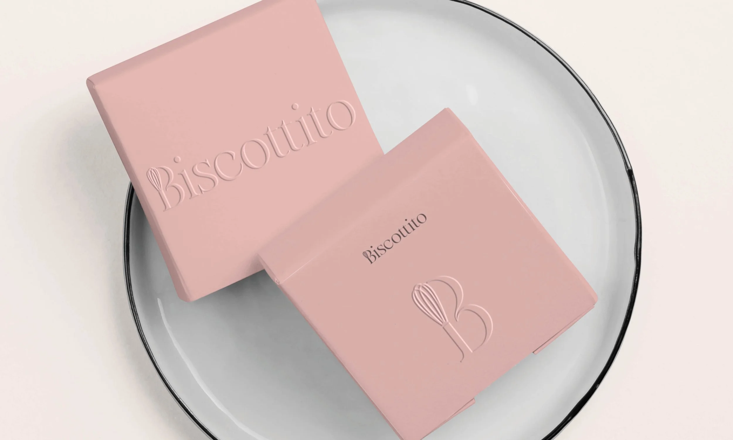
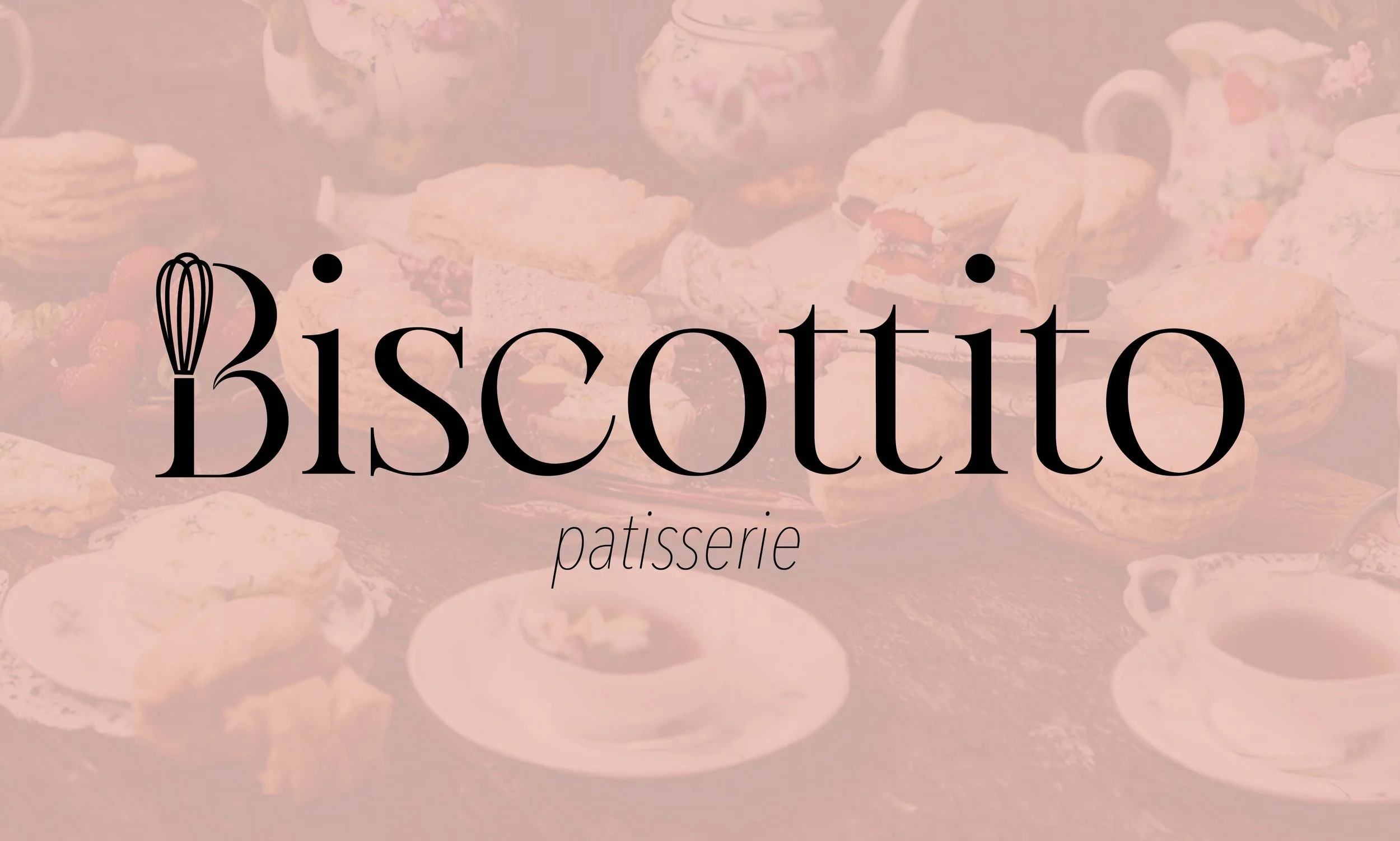
A logo was created to reflect the brand’s whimsical, friendly nature.
A colour palette of gentle pastels was used to evoke tactile sweetness and artisanal quality.
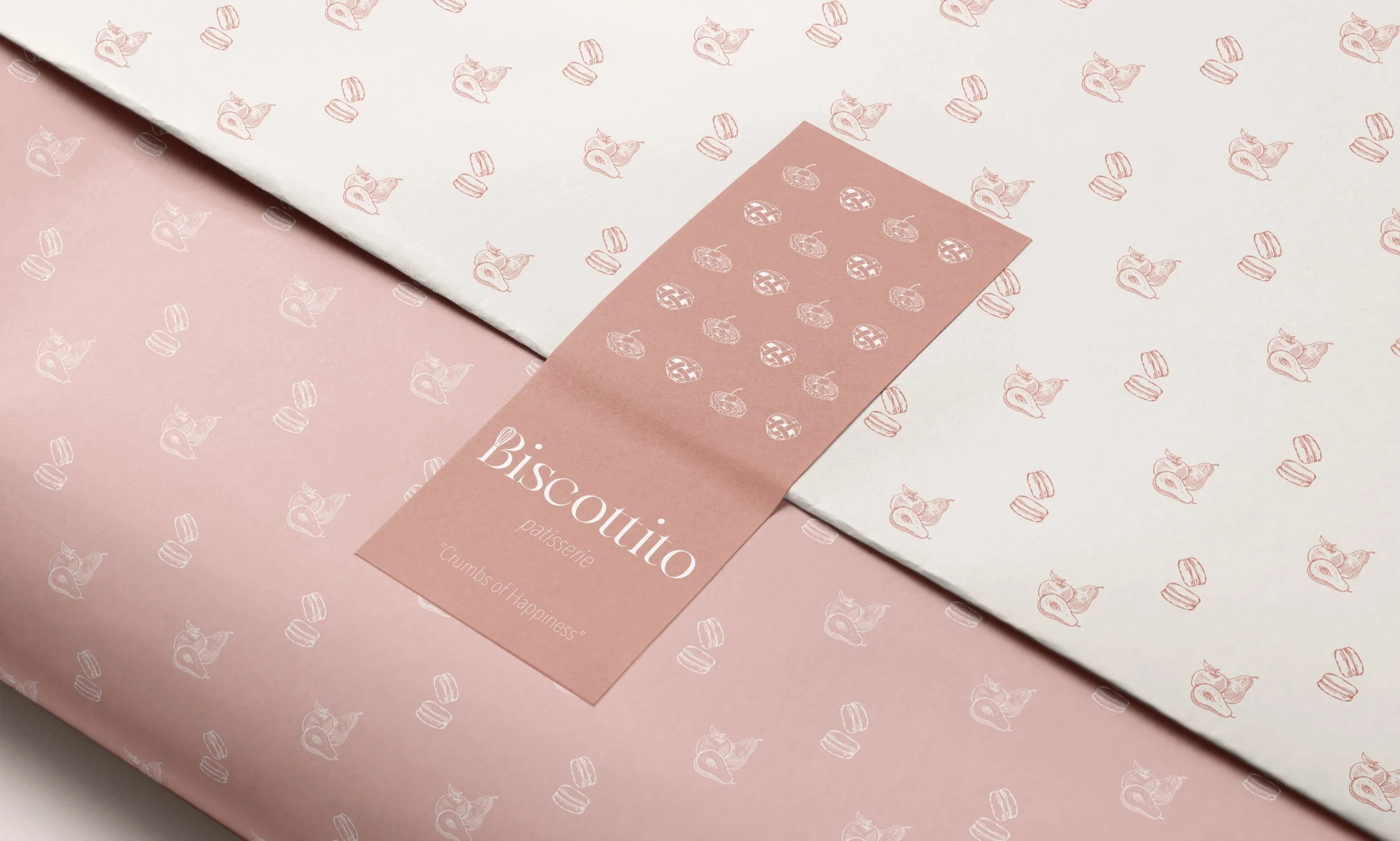
Packaging and visual executions were developed to reinforce the brand voice — soft, playful, and comforting.
The project presents a full brand ecosystem — from typography to mock-ups — that communicates the emotional tone of the patisserie.