Introducing
A Soft Journey Around the World
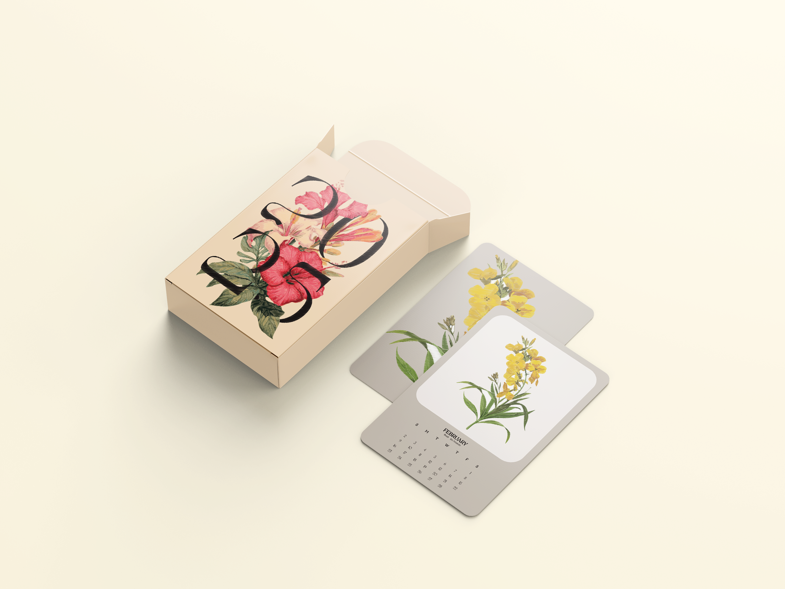
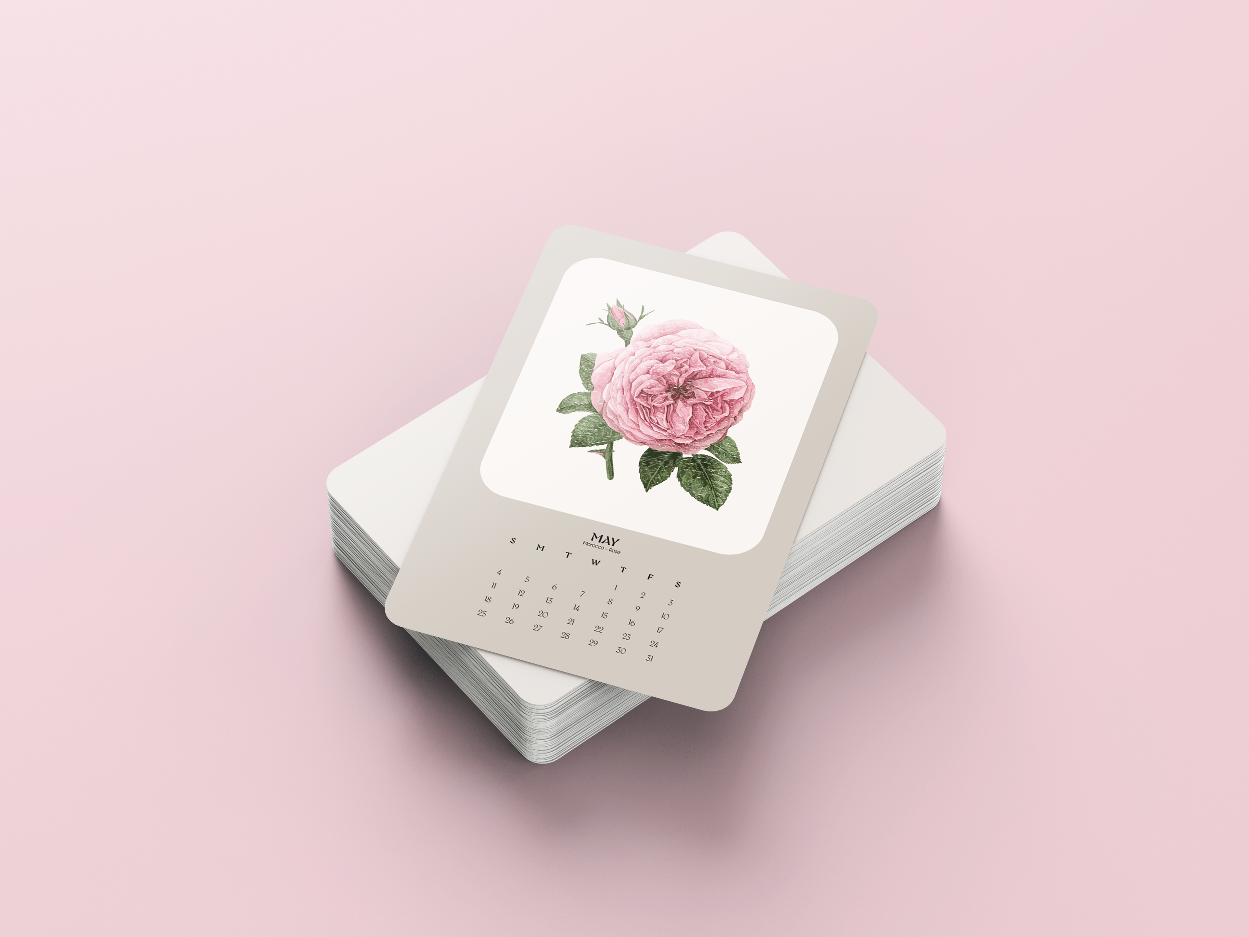
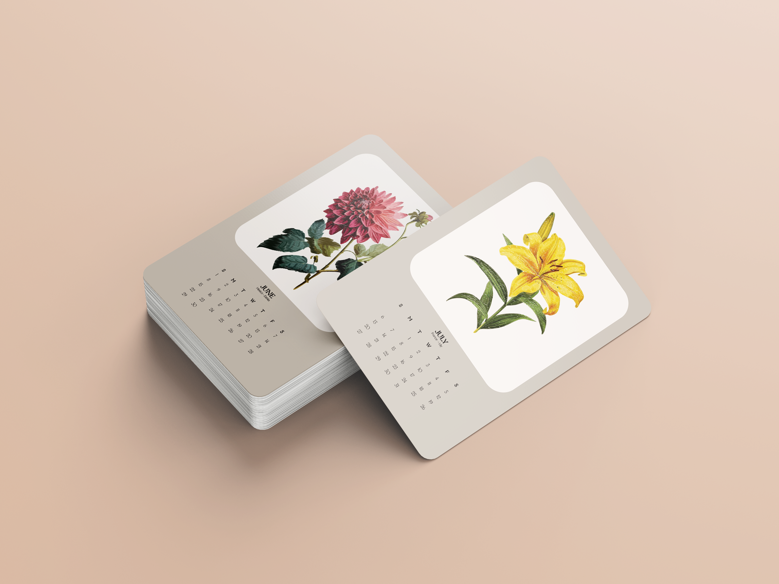
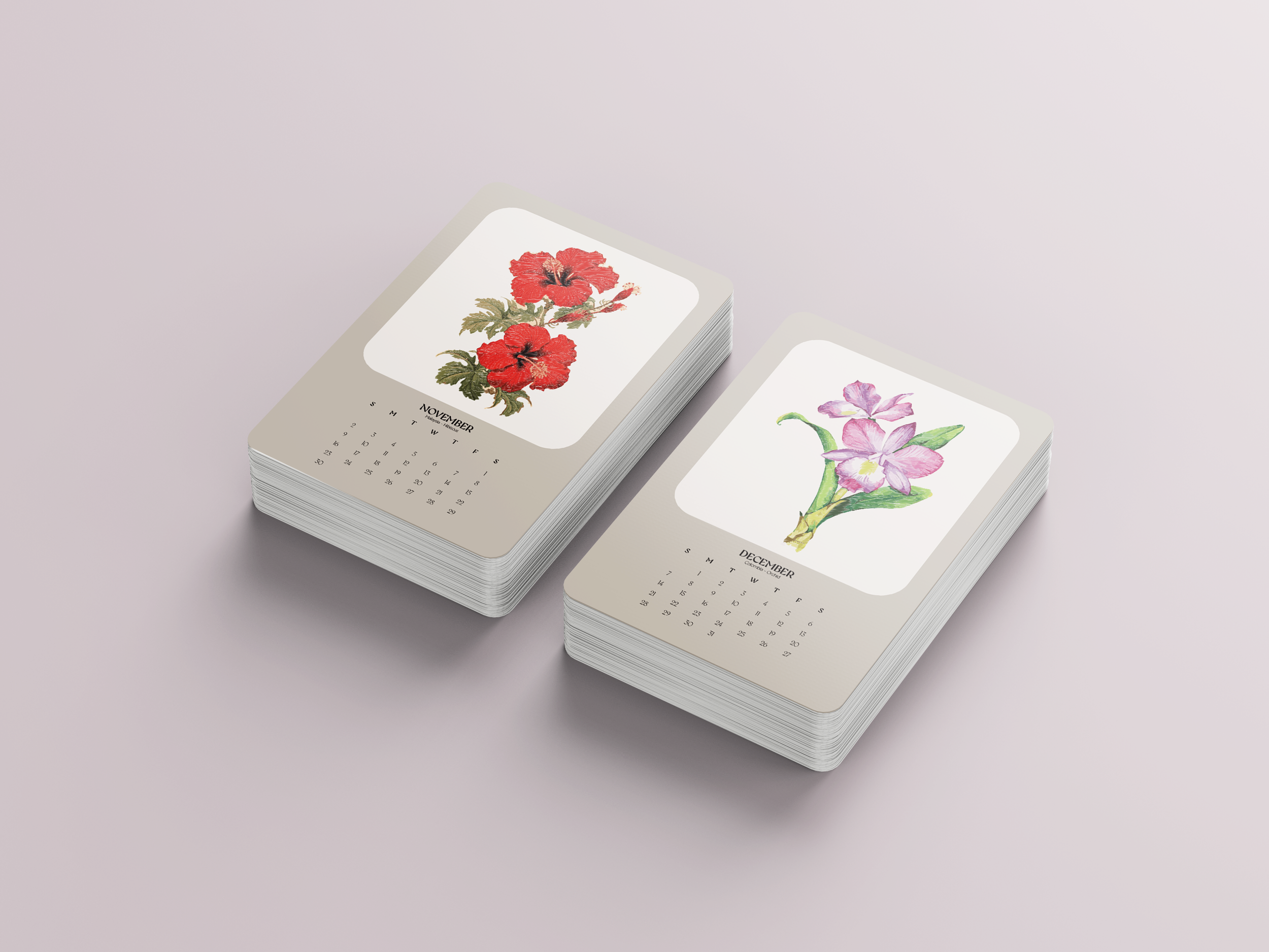
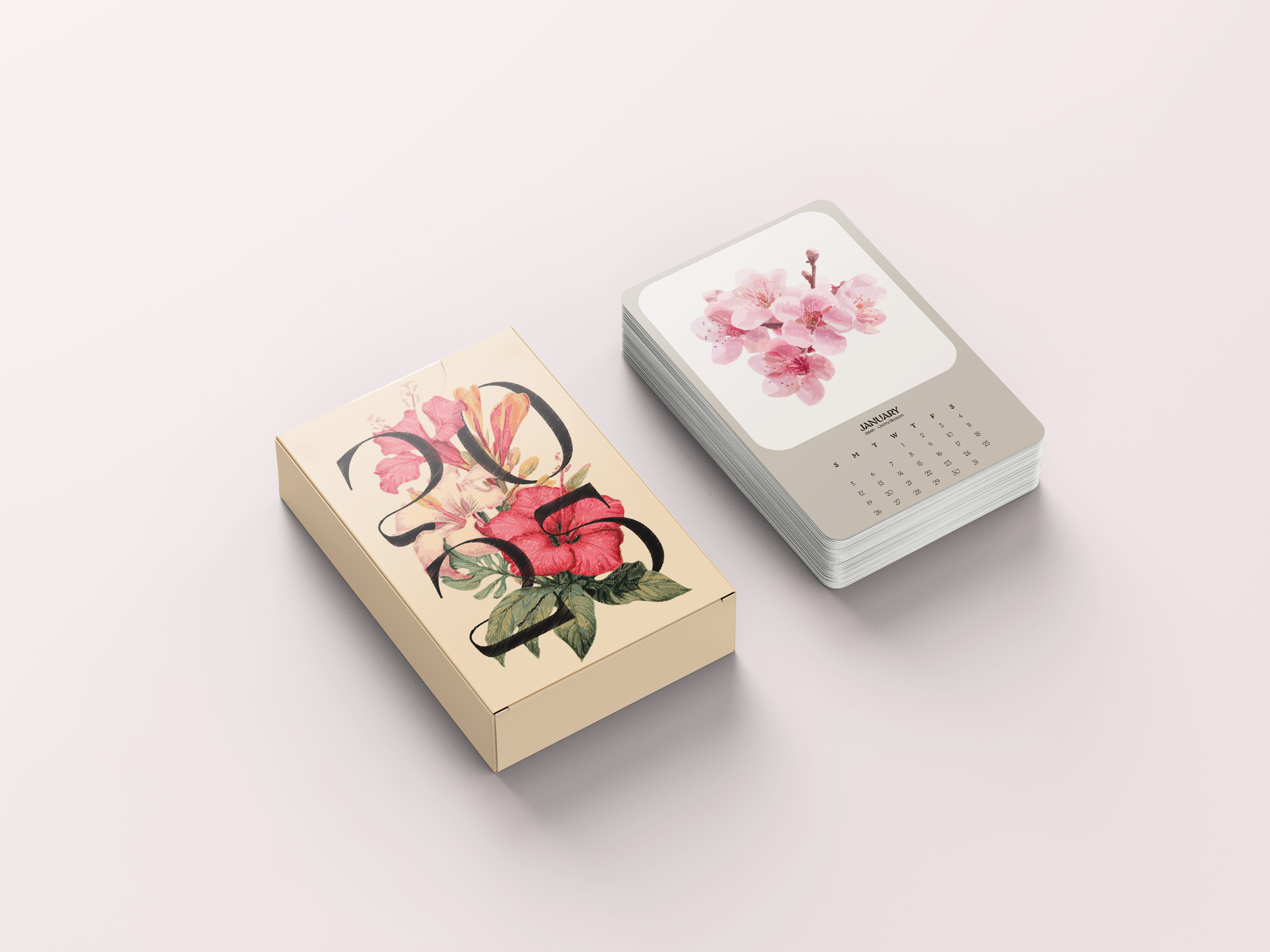
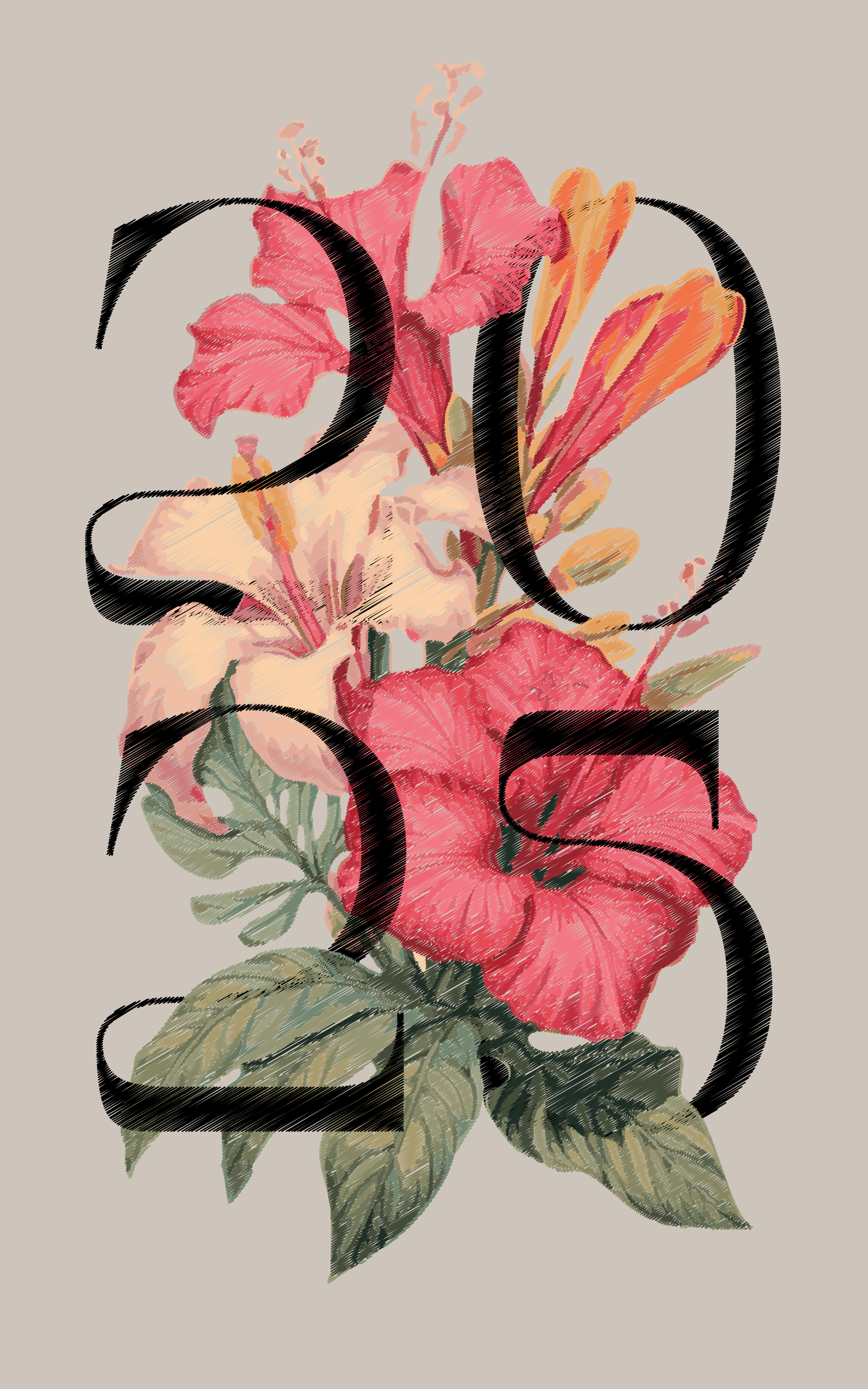
An editorial calendar concept that uses graphic design and colour to capture the mood of different countries through their national flowers and palettes, presented in a print and layout design format.
Published June 1, 2025.
Problem
The challenge was to translate the essence of travel and cultural atmosphere into a graphic design project that doesn’t just list destinations but feels like a visual journey. Instead of focusing on typical travel content or heavily detailed layouts, the project needed to emphasize mood and emotion through colour, imagery, and typography, particularly in a way that works as an annual calendar format. This meant balancing aesthetic simplicity with a distinctive representation of each place.
The design had to guide a viewer’s eye through time and place, month by month, while still feeling cohesive and poetic, not cluttered or literal.
Target Audience
People who enjoy visual storytelling and calm, evocative editorial design rather than dense infographic or travel guide styles.
Enthusiasts of print design and thoughtful layouts who appreciate how mood and colour can shape meaning.
Readers drawn to cultural exploration presented through design elements like palette, texture, and soft imagery.
Concept
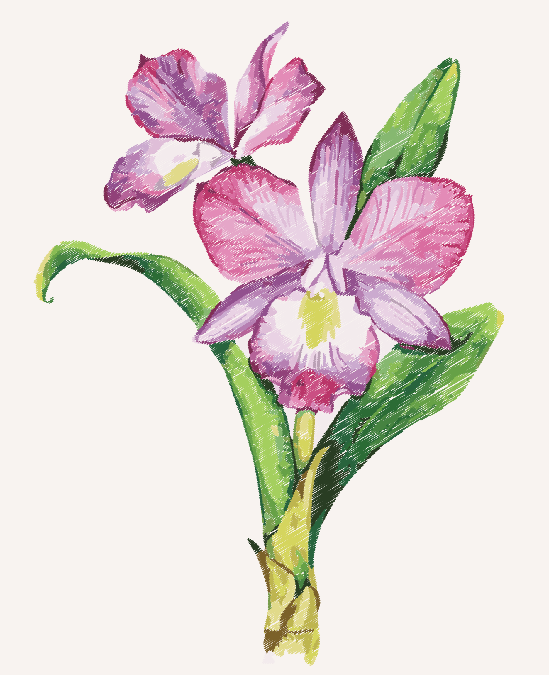
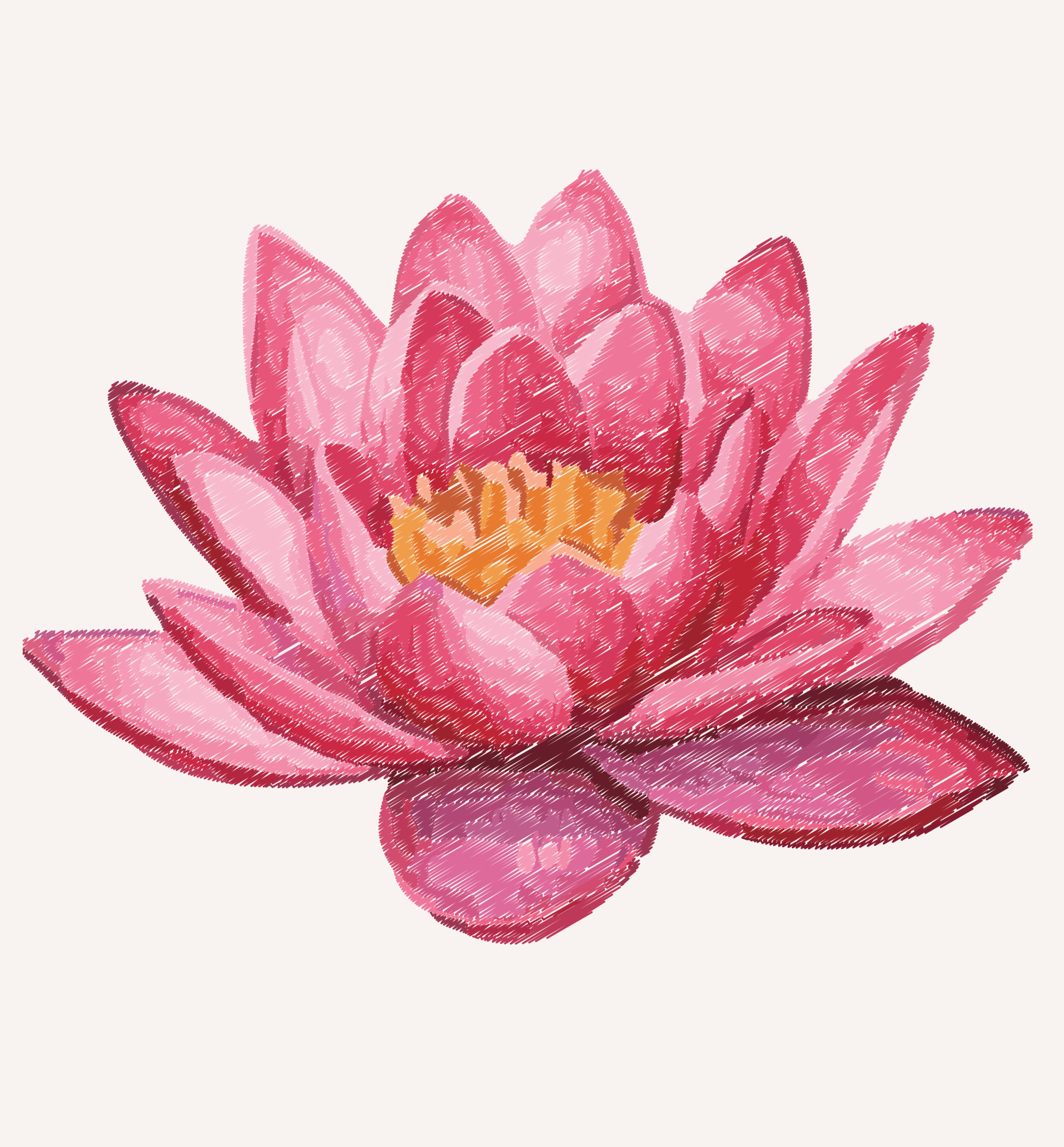
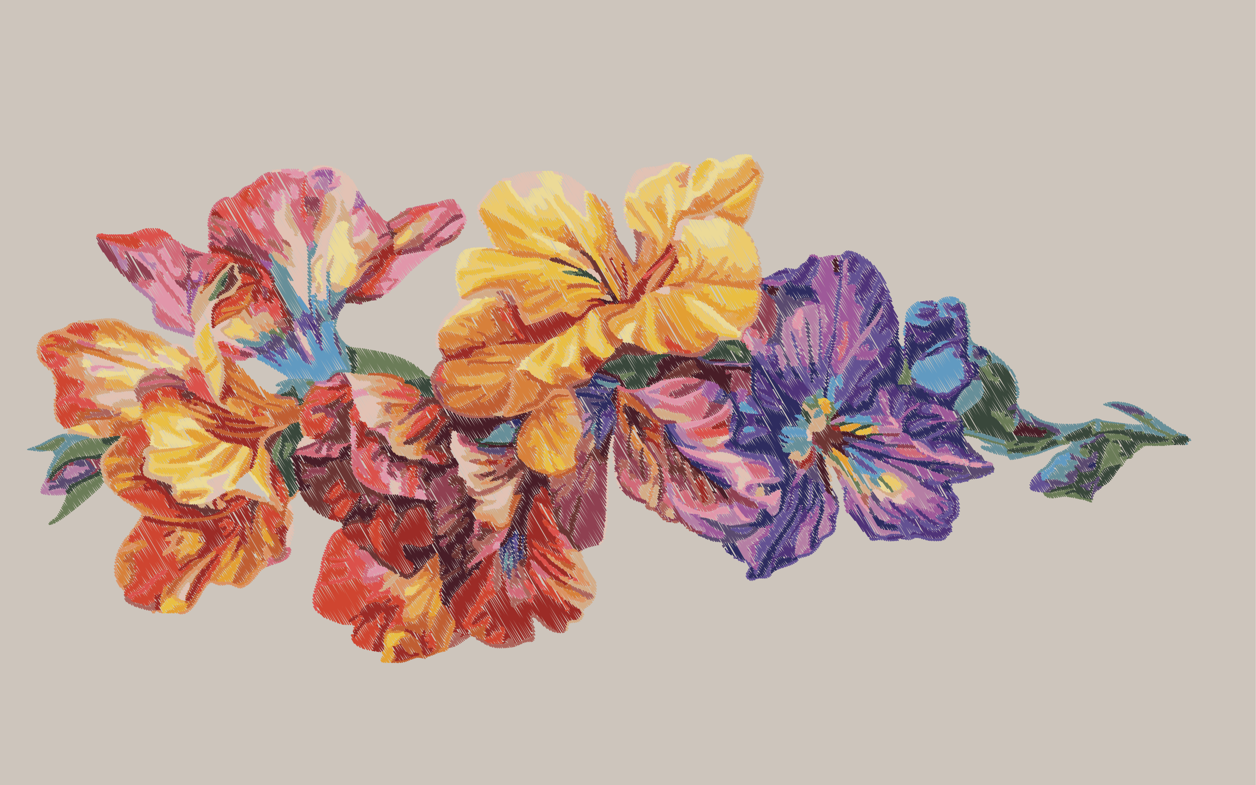
The core idea is a visual, sensory journey around the world, with a soft, simple colour palette and a seasonal progression. Each month of the calendar is inspired by a different country’s national flower and cultural mood, using gentle colours to reflect landscape and identity — from Japan’s quiet blush tones to Colombia’s vivid orchid hues.
Key conceptual drivers include:
Colour as emotion and place — palettes evoke not only visual beauty but atmosphere.
Minimal, calming design — soft tones and restrained graphic elements that mirror the feeling of each environment.
Narrative flow — the calendar acts like a timeline of cultural experiences, guiding the viewer gently around the world month by month.
The result is a project that feels like travel, not just information, where design choices evoke memory, place, and mood.
Solution
To address the problem and realize the concept, the project produced:
A monthly calendar layout that uses colour and floral inspiration as the core narrative device.
Soft, cohesive colour palettes for each country to communicate emotional and cultural identity.
Clean, balanced design and typography that emphasize visual calm and clarity.
Visual storytelling across the printed calendar format rather than purely informational graphics, supporting an immersive experience.
Every part of the design — from the softness of the tones to the simplicity of the layout — works to translate the feeling of global landscapes into a personal and calm calendar journey.