Introducing
Cafe Menu Design
Menu design and visual concept for a café experience — focusing on graphic design and layout.
Published May 31, 2025.
Problem
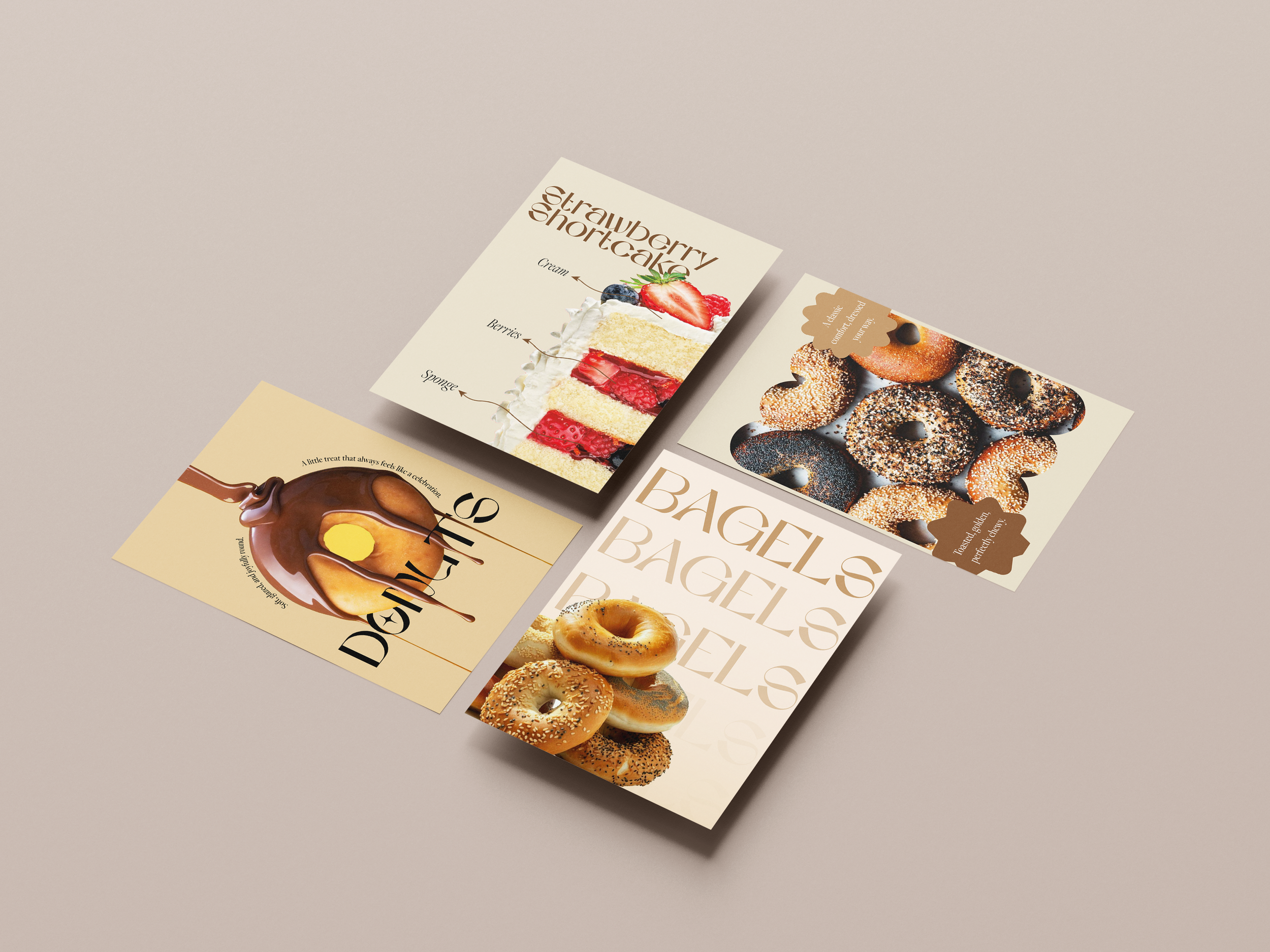
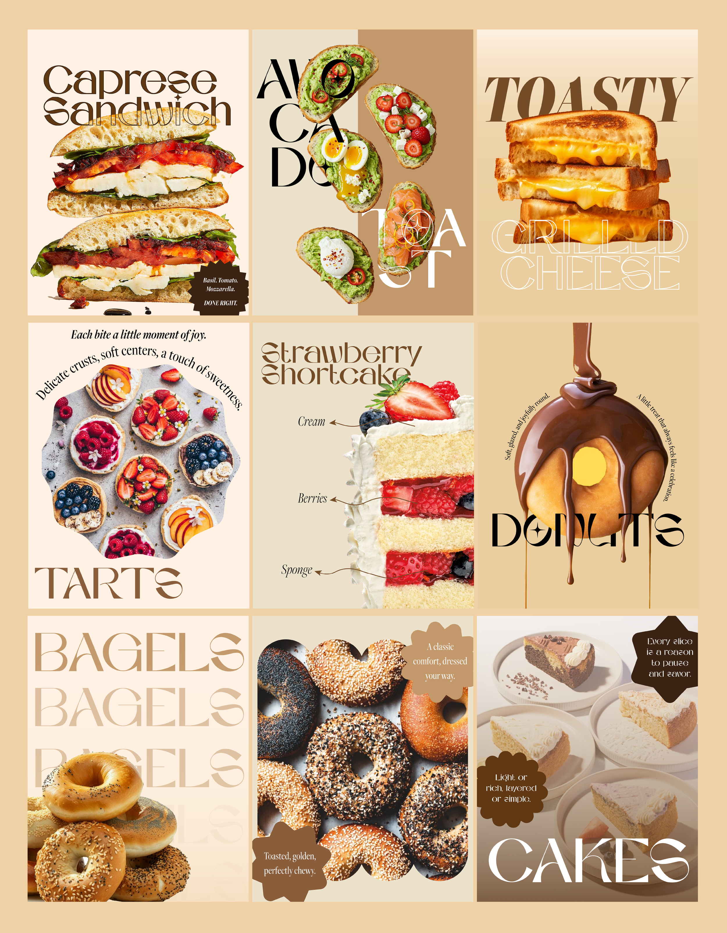
The project’s purpose was to create a menu layout and design system that visually reflects the atmosphere of calm, slow mornings and intentional rituals. The challenge was to translate the feeling of comfort and simplicity into a clear, functional, and welcoming menu layout, balancing design expression with readability.
Target Audience
Coffee lovers and café patrons who value atmosphere and ritual.
People who appreciate a quiet, intentional, and aesthetically refined experience — especially those drawn to calm, minimal visuals over loud or busy designs.
Urban customers, freelancers, or creatives who may use cafés as places to work, relax, or socialize. (Inferred from the tone and context of the design)
Concept

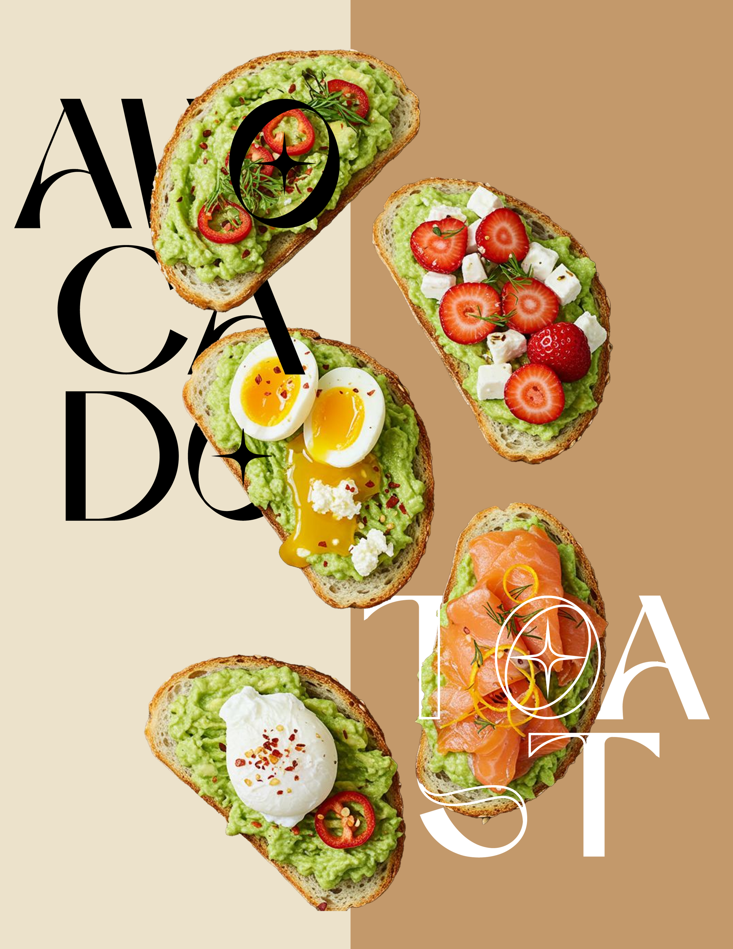
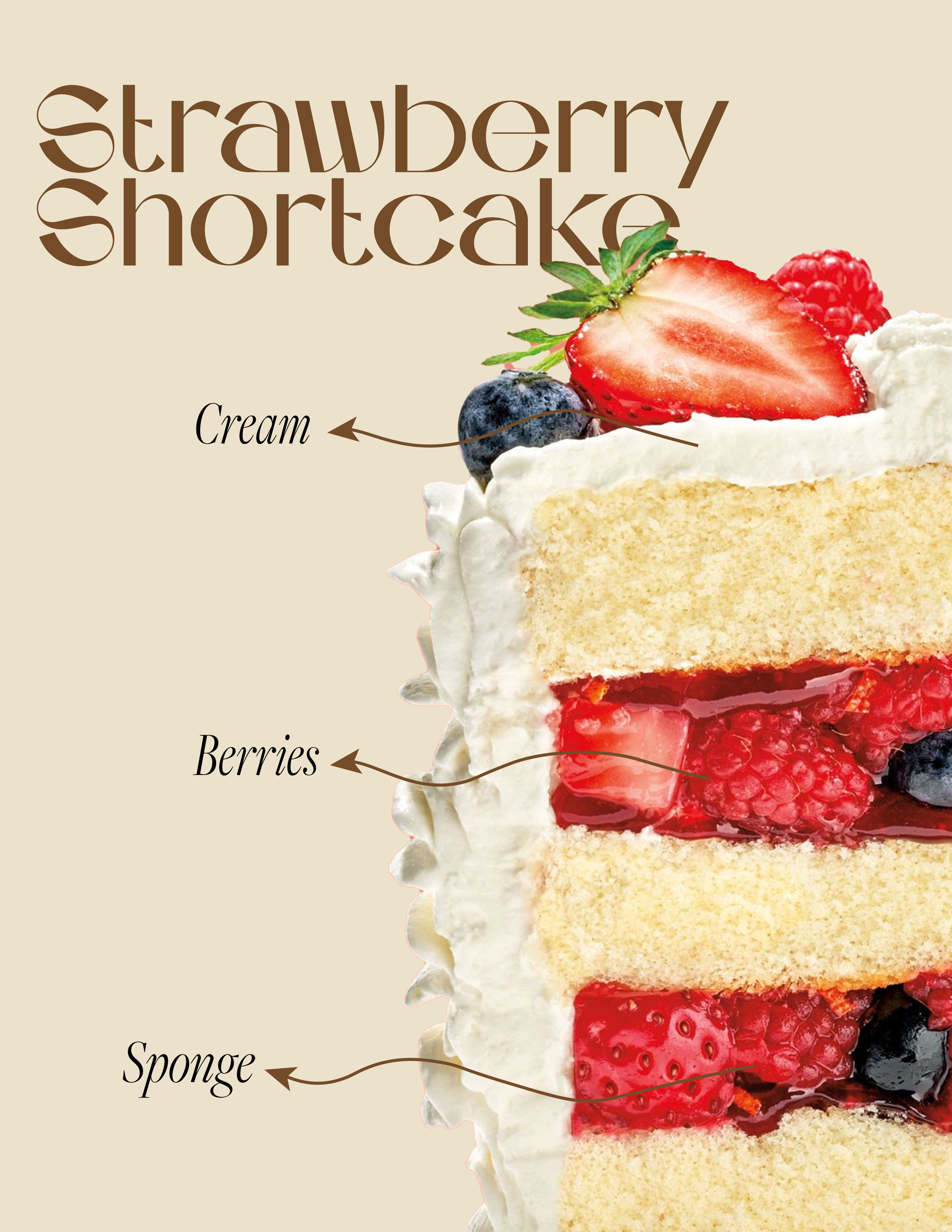
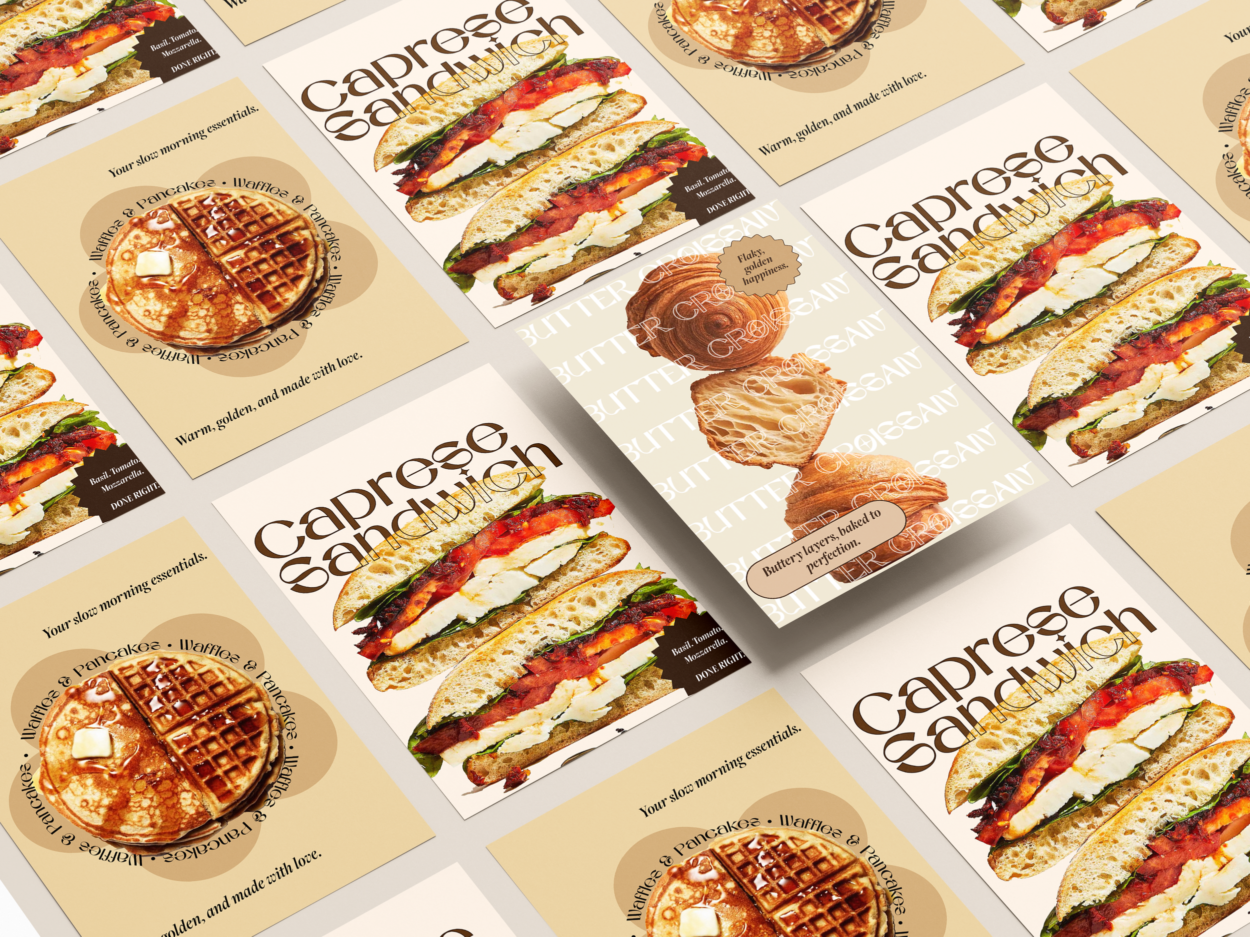
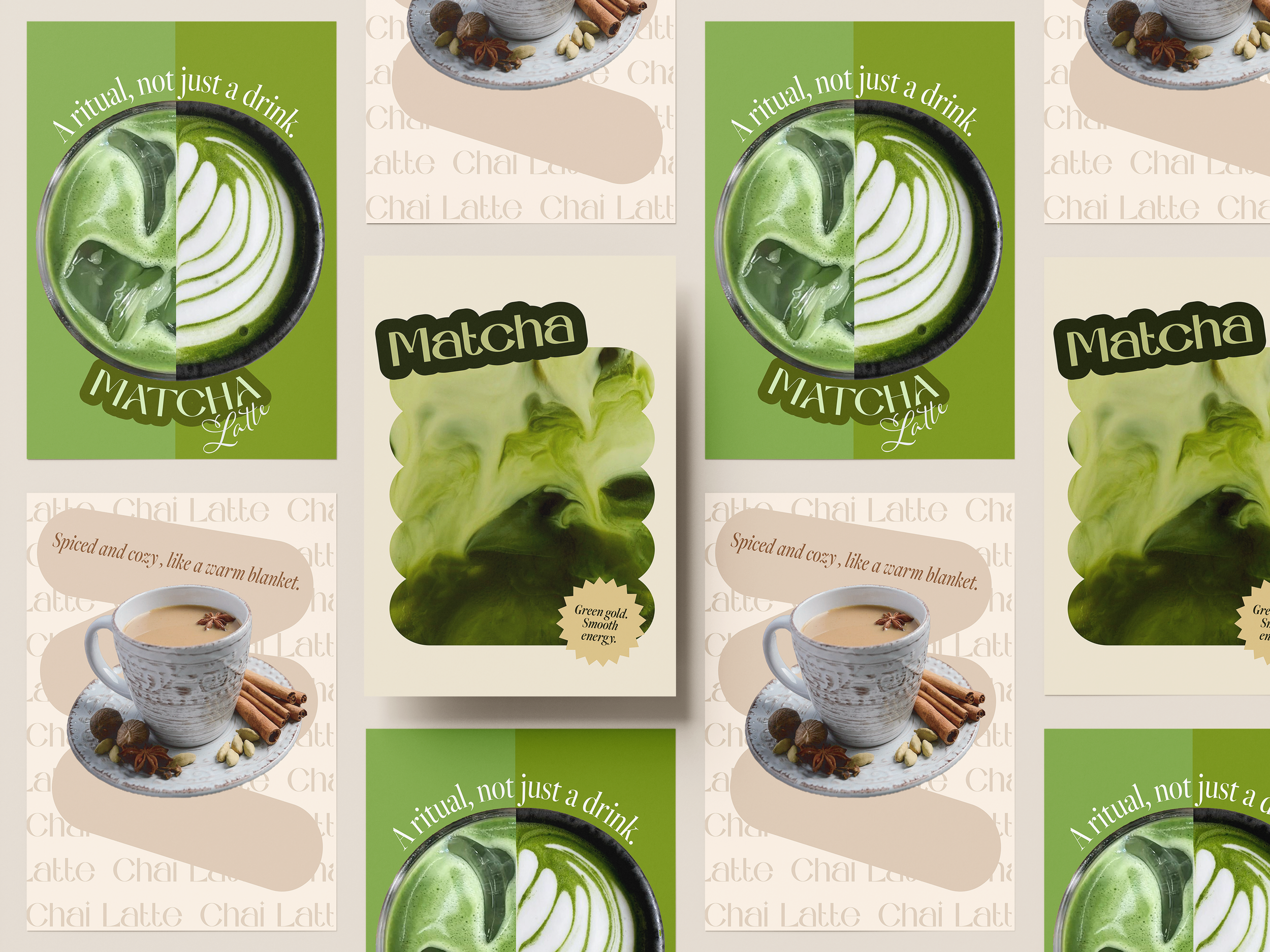
The concept is rooted in minimalism, balance, and calm. The design uses:
Soft tones that evoke warmth and relaxed mornings.
Refined typography that feels gentle, intentional, and easy to navigate.
A disciplined grid system to give the layout clarity and rhythm.
Visual elements chosen to make the menu feel as comforting as the first sip of coffee.
The overall visual identity communicates quiet warmth and visual ease.
Solution
To solve the original design challenge, the project delivered:
A clean, minimalist menu layout that balances visual calm with functionality.
A simple visual system of soft colors and refined type that aligns with the café’s emotional and experiential goals.
Thoughtful spacing and hierarchy that make it easy for customers to scan offerings quickly without feeling overwhelmed.
The result is a cohesive menu experience that feels comforting, intentional, and aligned with slow, mindful café culture — visually echoing the mood of a calm morning with coffee.